Do you admire the beauty of Impressionist masterpieces but find their price tags
out of reach? What if you could capture that same ethereal charm and vibrant
energy with your own hands? Join us on a creative journey as we guide you
through making your very own stunning, seaside-inspired Impressionist
painting. This easy-to-follow tutorial will empower you to create a work of
art that would make even the great masters like Monet and Renoir nod in
approval – all while being incredibly budget-friendly! Dive into the world of
DIY art and transform an ordinary canvas into an extraordinary piece of home
decor.
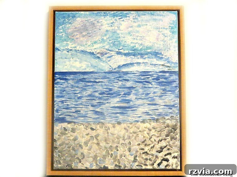
Unveiling the Magic of Impressionist Art
Before we pick up our brushes, let’s delve briefly into the captivating world
of Impressionism. This revolutionary art style emerged in France during the
mid-to-late 19th century, marking a significant departure from traditional,
academic painting. Impressionist artists were not concerned with meticulous
detail or historical narratives; instead, their primary goal was to capture
the transient “impression” of a scene, particularly the fleeting effects of
light and atmosphere. They sought to render the visual impression of the
moment, often focusing on subjects from modern life, landscapes, and city
scenes.
Characterized by small, visible brushstrokes, often applied thickly and side
by side, Impressionist paintings create a sense of movement and immediacy.
When viewed from a distance, these individual strokes blend in the viewer’s
eye, forming a coherent, vibrant image. This technique, known as “broken
color,” allowed them to depict the shimmering quality of light and the
vibrancy of natural colors. Key figures like Claude Monet, known
for his series of water lilies, haystacks, and Rouen Cathedral facades which
explored light at different times of day, Auguste Renoir, celebrated for
his joyful scenes of Parisian life and portraits, and Edgar Degas, who focused
on dancers and everyday moments, pioneered this movement. Their innovative
techniques emphasized color, light, and texture, often painting outdoors (en
plein air) to directly observe nature’s ever-changing moods. This style’s
emphasis on personal perception and the beauty of ordinary subjects makes it
incredibly accessible and inspiring for aspiring artists today, offering a less
intimidating path to creating striking artwork. You can explore more
about the rich history and characteristics of Impressionist paintings on
the Sotheby’s website for a deeper understanding.
From Unwanted Print to Upcycled Impressionist Masterpiece: The Story
My personal adventure into the realm of Impressionistic art began quite
unconventionally, proving that creative inspiration can strike anywhere. While
browsing the aisles of my local Marshall’s, a piece of art caught my eye – not
for its subject matter, but for its hidden potential. It was a framed print,
discounted to a mere $8. Being someone with a notorious “brown thumb,” the
botanical artwork itself held no appeal. However, the frame was another story.
It had a classic elegance that immediately sparked ideas, specifically for an
upcycled art project.

My initial thought was to enlist my artistically talented daughter to paint
something new over the existing print. I envisioned her transforming it into
a beautiful new piece for our home, perhaps a modern abstract or a charming
illustration. Eagerly, I sent her a text, proposing the idea. To my surprise,
and a slight hint of disappointment, she politely declined, stating she was
too busy with her own projects.
But this minor setback wouldn’t deter my creative spirit. Despite her
rejection, I still bought the framed canvas. After all, the frame alone was
worth more than the asking price, and the canvas itself offered a perfect
base for experimentation. A new challenge emerged: if she wouldn’t do it, I
would! I decided to take on the task myself, seeing it as a fantastic
opportunity to create a unique piece of DIY Impressionist art. This project
transformed from a simple purchase into a personal artistic quest, proving
that inspiration can strike in the most unexpected places and from the most
unexpected rejections. It was a chance to explore my own artistic capabilities
and breathe new life into an otherwise overlooked item, turning a bargain bin
find into a potential focal point for my home decor. This commitment to
upcycling not only saved money but also gave a second life to something that
might have ended up in a landfill.
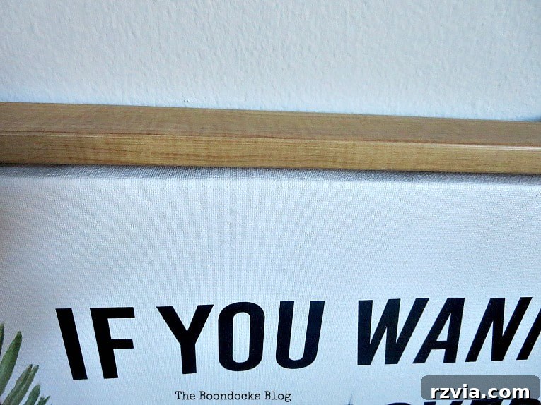
Upon closer inspection at home, when I removed the cardboard edges, I discovered
the frame’s inner edges were plastic, not wood as I had initially hoped. However,
this minor detail didn’t dampen my enthusiasm for the project. I was committed
to forging ahead, determined to create my very own captivating landscape
Impressionism painting. This journey of upcycling an inexpensive find into a
personalized work of art is not only satisfying but also a wonderful way to add
character to your living space without breaking the bank. It’s about seeing
potential where others might see discard.
Essential Materials for Your DIY Impressionistic Art Project
Gathering your supplies is the first exciting step in any art project. For
this accessible Impressionist painting, you won’t need an extensive artist’s
studio or expensive materials. Acrylic paints are wonderfully versatile and
user-friendly, making them perfect for beginners. Here’s a concise list of
what you’ll need, along with a few tips for selection:
-
Canvas in a frame (14″ by 18″ or similar size): An old,
upcycled framed print works perfectly as it provides a sturdy base and a
ready-made frame. Alternatively, you can use a plain stretched canvas. The
frame adds an immediate touch of professionalism to your finished piece and
can elevate even the simplest painting. -
Masking tape or painter’s tape: Essential for protecting
your frame from paint splatters. Painter’s tape is often preferred for its
clean removal, preventing any sticky residue on your frame. -
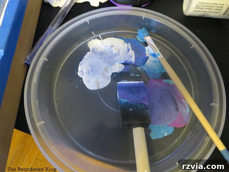
Various acrylic paints: Acrylics are ideal for beginners
due to their fast drying time, ease of use, and water solubility, making
cleanup a breeze. For a seaside landscape, focus on a palette of blues
(light blue, medium blue, dark blue/navy), white, black, and perhaps a touch
of red, purple, or even a sandy beige for atmospheric effects and foreground
details. Student-grade acrylics are perfectly adequate for this project. -
Sponge brush: Great for applying broad, textured strokes,
especially for skies and water. This tool helps achieve that characteristic
Impressionist softness and subtle blending without requiring advanced brush
techniques. -
Small brushes: A variety of smaller, stiffer brushes (flat,
round, or filbert shapes) will be useful for more controlled details,
layering colors, and creating the distinct visible brushstrokes that define
Impressionism. Choose brushes that feel comfortable in your hand.
Step-by-Step Guide to Your Easy Beginner Impressionist Painting
Now for the exciting part – bringing your vision to life! This guide is
designed for beginners, focusing on simplicity, embracing imperfections, and
the core principles of Impressionism to create a beautiful seaside scene.
Step 1: Preparing Your Canvas Base for a Fresh Start
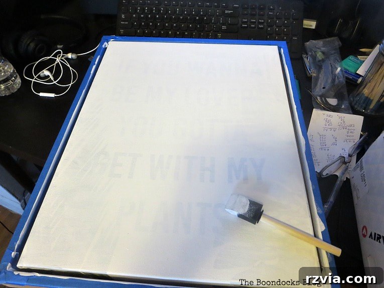
My first task was to prepare the canvas, which meant completely covering the
old print. I carefully taped off the frame using masking tape to protect it
from paint splatters, ensuring a clean edge for the finished artwork. Then, I
began applying white acrylic paint, essentially using it as a gesso layer, to
hide the underlying botanical artwork. This process required patience; I ended
up applying six generous coats to adequately conceal the original print and
its stubborn words, letting each layer dry thoroughly before applying the next.
It might seem like a lot of paint, but a clean, neutral white base is crucial
for your new colors to truly pop and for the Impressionistic layers to build
effectively without interference from the old design. While I initially thought
this would be a swift step, the thorough coverage was worth the effort,
ensuring no remnants of the old print peeked through.
Step 2: Finding Your Inspiration – Choosing a Reference Image
As I’m not yet skilled enough to paint an entire scene purely from memory
with the nuances of light and shadow that Impressionism demands, I sought a
beautiful photograph to use as a reference. Finding a strong visual guide is
incredibly helpful, especially for beginners, as it provides a framework without
requiring you to copy every detail meticulously. I discovered a captivating
image of a tranquil seaside landscape, featuring lovely shades of blue and
teal in the sky and sea, contrasted with earthy pebbles in the foreground. This
particular photograph, shown below, offered the perfect palette and atmospheric
qualities for an Impressionist piece, giving me a clear vision to work towards.

With my reference image in hand, I felt ready to channel my inner Monet! All
those years of art history classes were finally going to pay off, helping me
understand the core principles. Monet specialized in capturing “perceptions” –
the shifting light and sensory experiences of a scene rather than photographic
realism. If you examine his art up close, you’ll see a tapestry of distinct,
individual brushstrokes and dots of color; but step back, and a cohesive,
vibrant landscape emerges. This approach was perfect for me, as realistic
drawing isn’t my strong suit. But creating expressive, textural brushstrokes?
That I could master! This fundamental principle of Impressionism – forming an
image through many small, visible marks – makes it incredibly forgiving and
enjoyable for anyone, regardless of their drawing ability, encouraging a focus
on color, light, and texture.
Step 3: Laying Down the Horizon and Initial Color Blocks
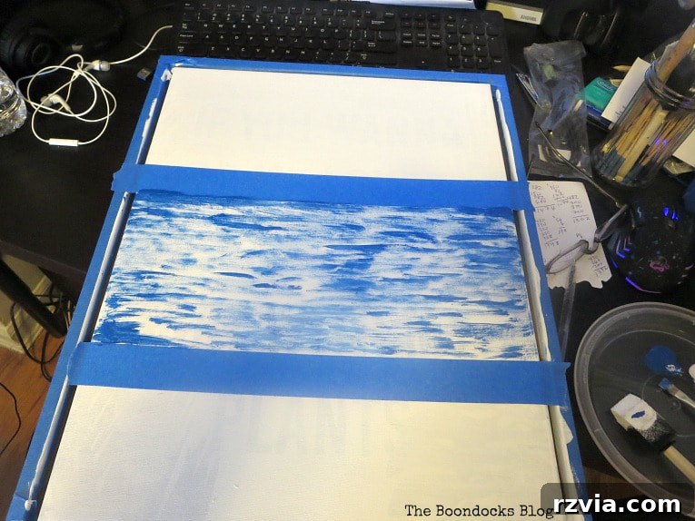
To establish the basic composition, I mentally divided the canvas into three
main sections: the expansive sky, the calm sea, and the textured foreground
(pebbles). I didn’t worry about perfect measurements or drawing precise lines;
the beauty of Impressionism lies in its organic, less rigid approach. Using a
small, stiff brush, I began applying a medium blue paint for the initial
layers of the sea, extending it up to what would become my horizon line. My
goal was to completely obscure those lingering words from the original print,
applying paint in varied, short strokes. This initial layer provides a solid
foundation of color and texture, creating an underlying vibrancy that will show
through subsequent layers.
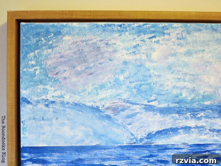
Step 4: Crafting the Impressionistic Sky with Sponge and Brush
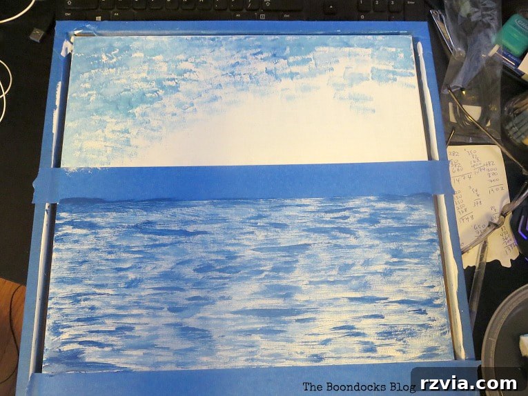
Next, I focused intently on the sky, aiming for a dynamic and textured
appearance that captured the lightness and depth of the atmosphere. I
switched to a sponge brush and used a lighter, turquoise blue paint. Instead
of smooth, even strokes, I “stabbed” the brush onto the canvas in short,
energetic bursts, almost like stippling. This technique naturally created a
mottled, cloud-like effect, allowing the white underlayer to peek through in
places. Sometimes, the turquoise would mix slightly with the underlying darker
blue or even the white base, resulting in beautiful, varied tones – exactly
the kind of atmospheric depth an Impressionist sky needs. Don’t be afraid to
let colors blend imperfectly on the canvas; it adds to the natural, fleeting
quality of the impression.
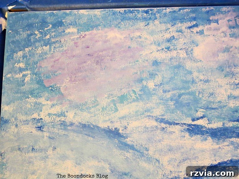
To add more visual interest and simulate the soft, often subtle hues of clouds
at sunset or dawn, I went back with a small brush and introduced a mere hint
of red into some selected areas of the blue sky. This subtle addition created
delicate lilac and purplish tones, mirroring those visible in my reference
photograph. These hints of complementary and tertiary colors, applied with
light, broken strokes, provide a realistic illusion of depth and atmospheric
light, crucial for capturing the true ‘impression’ of a real sky rather than
a flat, monochromatic blue.
Step 5: Texturing the Foreground – Painting the Pebbles
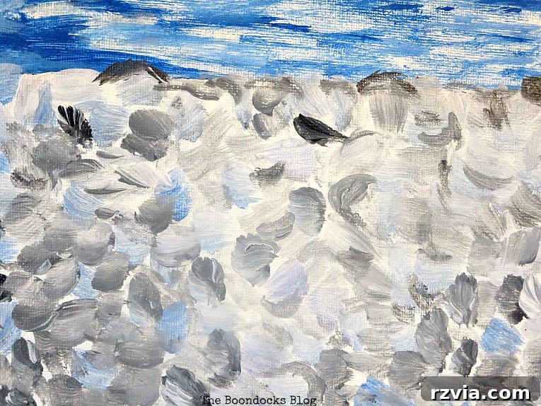
For the pebbly foreground, I aimed for texture and varied tones rather than
individual realism. I used a combination of black, white, and a hint of blue
to create a natural, earthy feel. Rather than painting each pebble
individually (which would contradict the quick, perceived style of
Impressionism), I used short, “fat” brushstrokes, applying the paint with a
dab-and-drag motion. By layering these colors and allowing them to mix slightly
on the canvas, I achieved the impression of numerous, distinct pebbles without
needing to define each one with precision. The blue tones integrated into the
pebbles subtly connect the foreground to the sea and sky, creating a cohesive
landscape and reflecting the ambient light of the seaside.
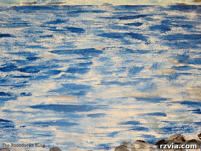
Step 6: Adding Depth and Movement to the Sea
The sea needed more than just a single shade of blue to truly come alive and
convey a sense of depth and movement. To achieve this, I returned to the sea
area, this time adding short, horizontal strokes of grey. These strokes,
applied over the existing blue layers, create visual interest and make the
water appear more dynamic and realistic, reflecting various light conditions
and subtle undulations. Remember, in Impressionism, it’s all about building
up layers of color and texture through visible brushstrokes, allowing the eye
to blend them and perceive depth and form. Don’t strive for photographic
accuracy, but rather the ‘feeling’ of the sea.
Step 7: Final Touches and the Rewarding Revelation
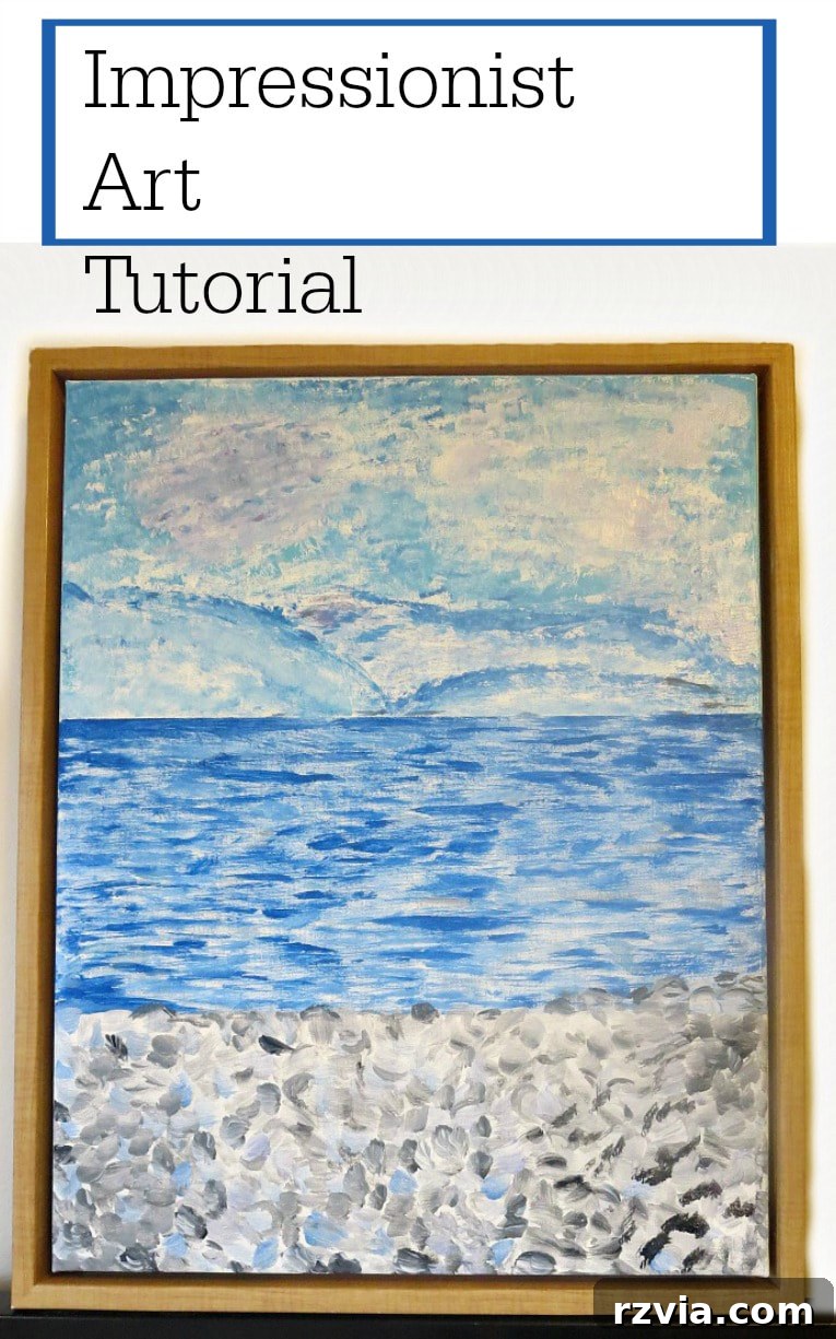
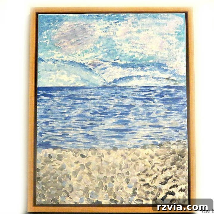
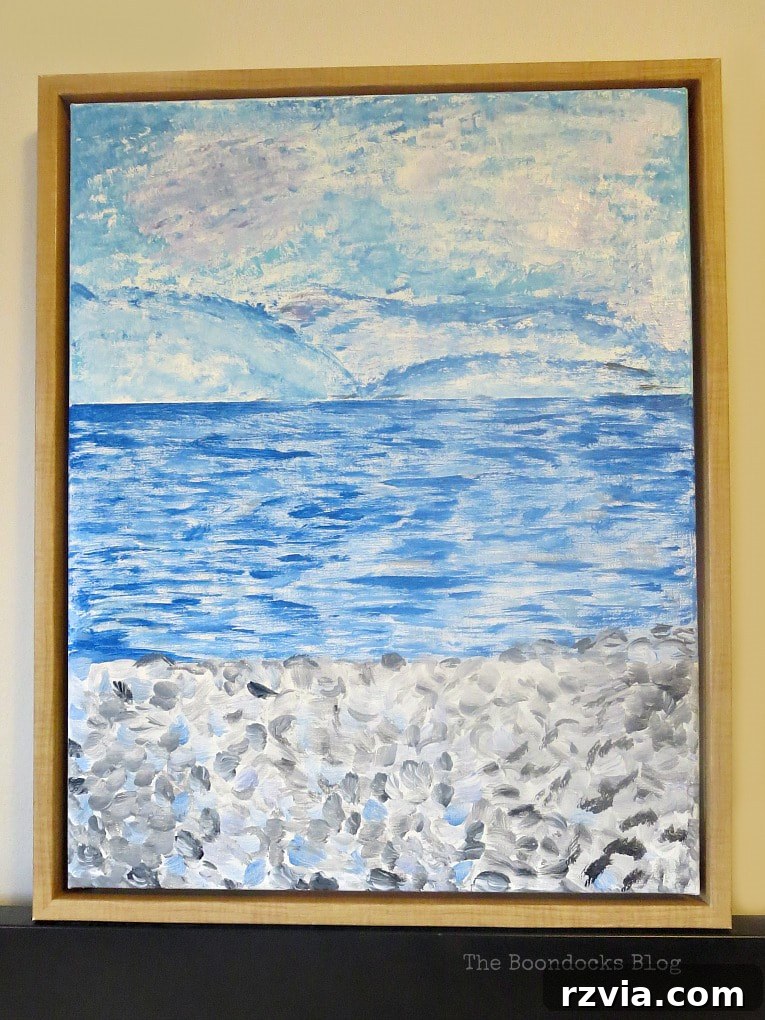
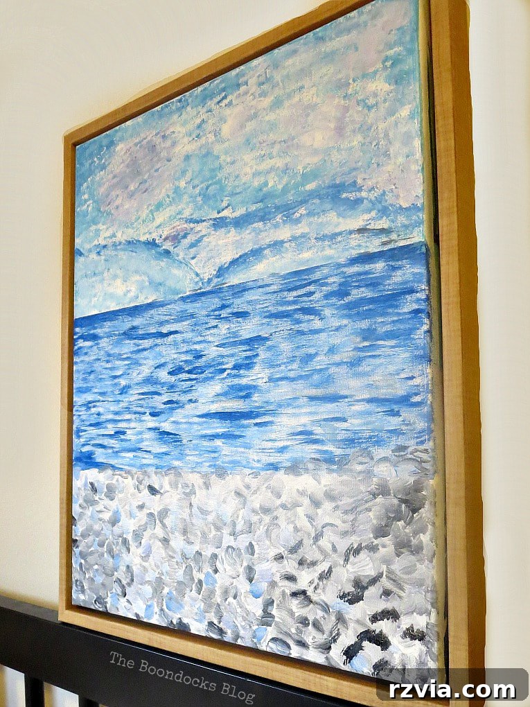
With the various elements thoughtfully in place, my Impressionist seaside
painting was complete! I made sure the horizon line remained relatively
straight and stable, providing a strong anchor for the overall composition.
However, the foreground pebbles allowed for more organic, flowing lines and
less rigid definition, adding to the natural feel. The most satisfying part?
Those pesky words and the original print were completely gone, swallowed by
layers of paint and transformed into a beautiful new scene. The successful
concealment was a testament to patience and persistence, proving that even a
challenging start can lead to a rewarding finish and a truly unique piece of
art. Step back and admire your handiwork – see how the individual strokes
blend into a cohesive image.
The Verdict: A Compliment of the Highest Order!
The true test of any artwork often comes from those closest to you, and my
Impressionist painting was no exception. When I unveiled my finished piece to
my artistically inclined daughter, her reaction was priceless. “It turned out
better than I expected,” she remarked. Coming from her, a budding artist with
a discerning eye and often blunt honesty, this was a compliment of the highest
order! Her words validated all the effort, the initial uncertainty, and the
creative leaps I had taken during the process. It was a wonderful confirmation
that stepping out of my comfort zone had truly paid off.
My other daughter, whose fondness for all shades of blue is well-known and
unwavering, immediately inquired about the proud new owner of this lovely
Impressionist painting – clearly implying herself! So, not only did I receive
a wonderful compliment, but I also had a happy daughter who was eager to
display my creation in her own space. There’s immense satisfaction in knowing
something you’ve crafted with your own hands can bring such joy and admiration
to your loved ones. These personal connections to art make the creative process
even more meaningful.
I must confess, creating this “Rotho-Monet-esque” Impressionistic painting was
an incredibly enjoyable and rewarding experience. If I had had more time, I
might have planned the composition a bit more, perhaps aiming for a larger
expanse of sea and fewer pebbles to truly mimic a vast ocean scene. However,
the spontaneous nature of this project, born from an impulse purchase and a
desire to upcycle, was part of its charm. Sometimes the best art comes from
less rigidity and more creative flow.
Never would I have thought I possessed the ability to paint a piece of art
like this, especially one inspired by such renowned masters. But breaking the
process down into manageable steps, coupled with the consistent guidance of a
strong reference image, made all the difference. Sticking to a limited
palette of just a few primary and secondary colors also greatly simplified the
process, allowing me to focus on brushwork and texture rather than complex
color mixing theories. This experience truly underscores a powerful lesson:
you never know what you can accomplish until you try. The act of creation
itself is a form of discovery, and often, the most beautiful and surprising
results emerge from unexpected challenges and a willingness to experiment.
Embracing this challenge to try new creative ideas, even under time pressure,
proved incredibly beneficial for my artistic growth. Having successfully
completed this Impressionist art painting, I’m already looking forward to my
next artistic endeavor. Perhaps a Rothko-esque black and white piece, focusing
on color fields and subtle texture, will be next on my list! Taking on these
creative challenges is a fantastic way to stretch your skills, discover new
passions, and enrich your home with unique, personalized decor that tells a
story. What about you? Do you have a favorite Impressionist painter whose
style you’d love to emulate, or perhaps a challenging art project you’re eager
to try? Share your thoughts and inspirations in the comments below! We’d love
to hear about your artistic journeys.
Additional Art Ideas for Aspiring Artists:
If you enjoyed this Impressionist painting project, here are a couple of other
beginner-friendly art and craft ideas to inspire your next creative session.
Explore the joy of making personalized decor for your home!